


Reviews
The Making of the Nomos Red Dot
The Making of the Nomos Red Dot
One such example, is the German word for home: Heimat. I encountered the word recently when I sat down with Thomas Höhnel of Berlinerblau (Nomos Glashütte’s design arm) and Martina Etti, Head of International Sales, Nomos Glashütte.

(From the left) Thomas Höhnel of Berlinerblau (Nomos Glashütte’s design arm) and Martina Etti, Head of International Sales, Nomos Glashütte
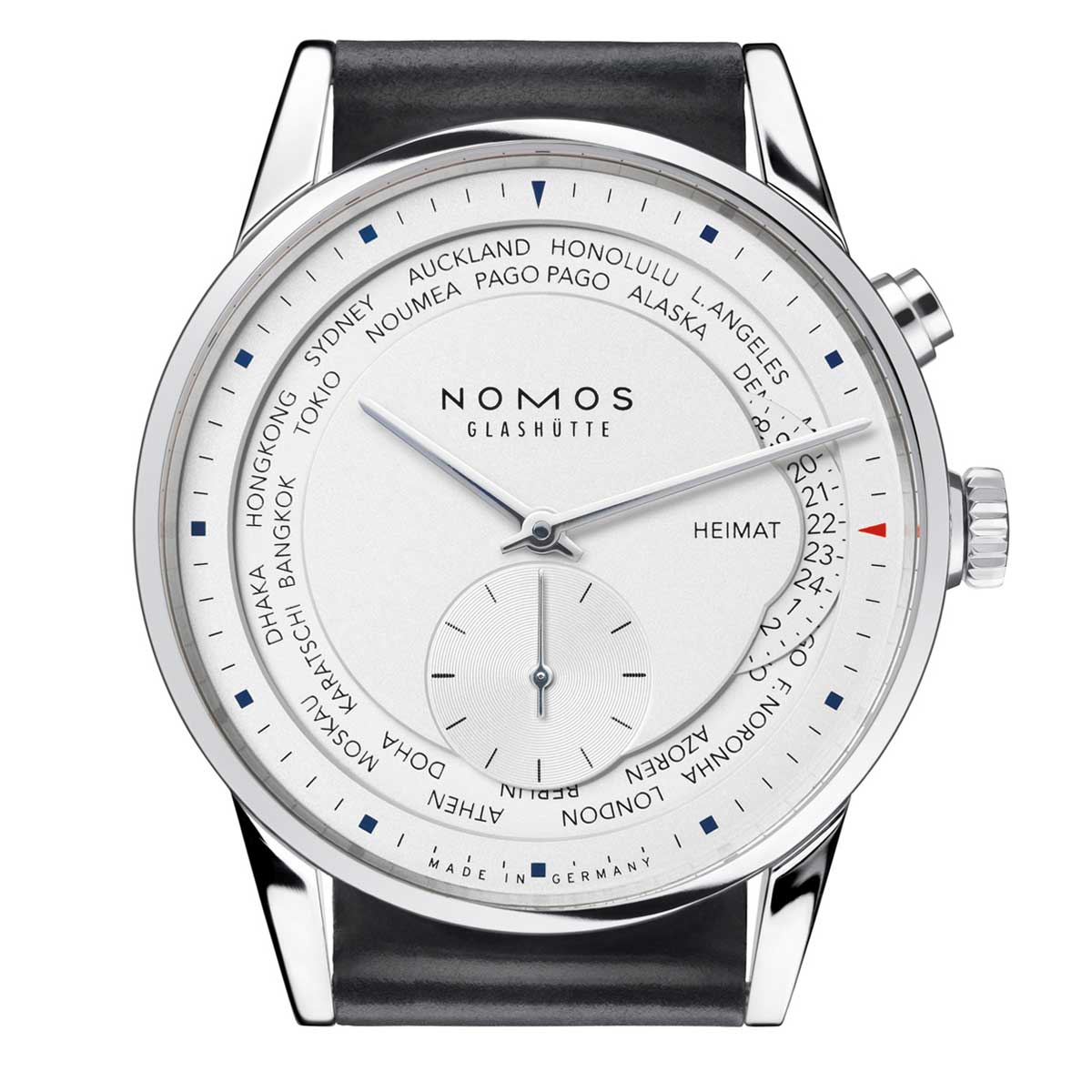
We were discussing how the Zürich Weltzeit, on top showcasing Nomos’ superb skill for executing pristine typography, also, very cleverly, incorporates iconography. A little home icon next to the 24-hour home-time disc, that visually reminds the wearer of home.
And it was here that Martina stopped to correct me.

The Nomos Red Dot, created in partnership with The Hour Glass and Watches of Switzerland in Singapore
“I was already with Nomos, back in 2007, when we introduced the world time. At that time, we were quite well-known in Germany, but on the global front we were a sort of best-kept-secret of the watch world. So, it’s not hard to assume that our international business was not very developed.
“When we had the multiple timezone complication introduced in the Tangomat GMT and soon in the Zürich Weltzeit — both of which use the same movement, just that they are expressed differently on the dial side — these weren’t simply the most complicated watches we had made, but at the same time we used these to really get our name out to the world.”
The Nomos Zürich Weltzeit in 2007
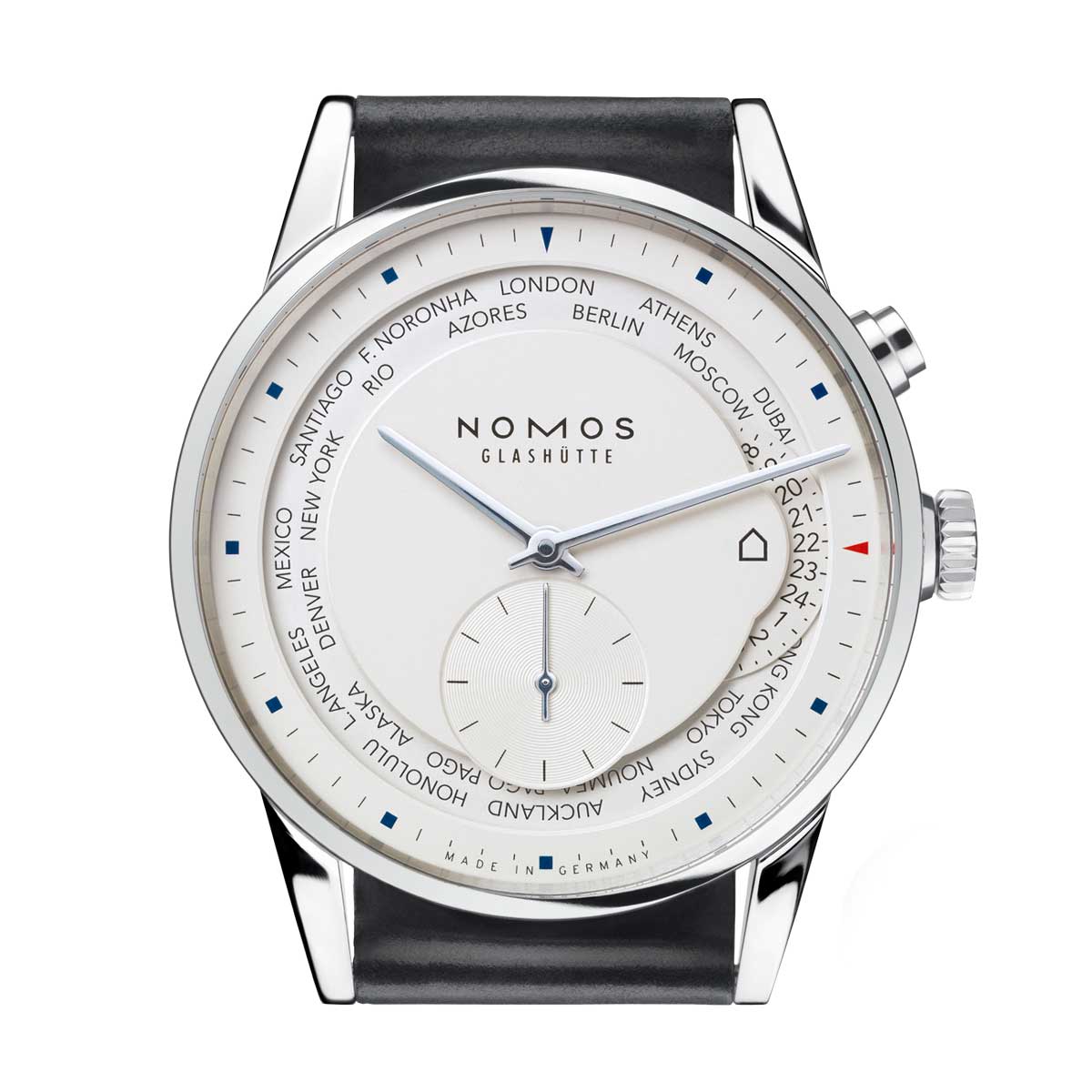
The Nomos Zürich Weltzeit with the "hut" icon
“In German, Heimat is very nice word. Its connotation is… Well, you know what? I don’t think I can find the absolute translation for it in English. It’s not only home, it’s more than that.”
Martina helps Thomas out here, “It’s a mixture between home, home-country — it’s where your grandma bakes the best warm apple pies in the whole world.”
The replacement of the word, Heimat was obviously an emotional challenge for the brand. But it was just as much a design challenge. Because Nomos had the Zürich Weltzeit’s dial design balanced to a tee thanks to the dexterity that the brand has demonstrated with their vast experience in typography.
To bring an icon into that could mean throwing the entire design off balance. Plus, Nomos were also afraid that in their pursuit of internationality, they might end up with a decision on the Zürich Weltzeit that would cause them to lose their German identity.
But, as we now know, the home icon was eventually incorporated into the dial, with careful consideration for its size and exact execution. For Nomos, it was pertinent that it should communicate the idea of home to whoever happens to be checking for the time back at home on the Zürich Weltzeit. At the same time, the icon was kept open enough for interpretation such that it holds the potential to trigger whatever memory of home the wearers’ subconscious might conjure up — be that for someone the thought of their grandma’s warm apple pie or for someone else the thought of their grandma’s steaming hot dumplings.
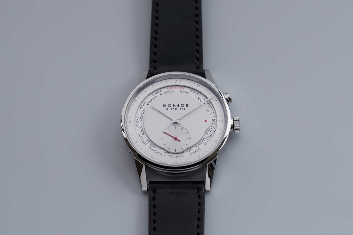
The Nomos Red Dot with a white dial
The watch decided upon was the Zürich Weltzeit and at that early phase it was naturally ascertained that they should replace the name of the GMT+8 city with that of Singapore’s on the city disc. In due course, there was a request from Michael Tay of The Hour Glass that the Nomos team should attempt a version of the limited edition to be made with a salmon colored dial.

The Nomos Red Dot with a salmon dial
“We thought about many elements — the flag of Singapore, the color red — but at Nomos we’re always trying to be minimalists and subtle with our executions. Everything we decide upon at the end of the day, must have its own reason and purpose. We don’t want to just print things on the dial,” says Thomas.
“While I was researching for the watch, I came across this term — the Little Red Dot — that seems to be quite widely used to refer to Singapore. I must admit I wasn’t familiar with the term until this point. But the deeper I dug into the story, the more confident I was that I had found the story that needed to be incorporated: A little red dot to symbolize Singapore as home in the Zürich Weltzeit. It was done.”
In true Nomos fashion, there was yet more decisions to be made about how large or small the dot was going to be. But once the point of balance was found, the 50 pieces (15 with the salmon dial and 35 with the white dial) were as good as snapped up.

The Nomos Red Dot with a white dial

NOMOS Glashütte


